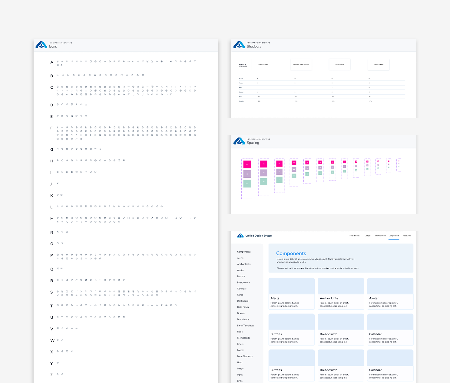
Albertsons Design System
The transformation of Albertsons' design system from a hastily developed initial version to a refined, scalable framework, focusing on establishing consistency, creating thorough documentation, and building a future-proof component library to meet the organization's evolving needs.
Situation
Albertsons, a large grocery retailer, was facing significant challenges with its design system. The initial version (v1) of the design system, although functional, had been rushed into production to address immediate needs. This led to several issues, including inconsistent spacing, typography, and color usage, as well as inadequate documentation. The design system was struggling to support the diverse range of products and users across the organization, and there was a clear need for a more scalable and consistent solution.
As an individual contributor (IC) designer focused on internal tools, I was brought in during the final phase of v1 to support its completion and to spearhead the development of a more robust and scalable v2 design system. My role required close collaboration with engineering teams, product managers, and other designers to ensure the new system would meet the needs of all stakeholders and be future-proof.
Role
UX Designer III, Design System Designer
Tools
Figma, FigJam, Adobe Creative Suite, Storybook, UDS Website
Team
Josh Cusick - Lead Product Designer, Design Systems
Emilio Torres Jr. - Staff Software Engineer
Nick Saunders - Senior Design System Engineer
V1 Approach not throughly documented


Task
My primary task was to transition the design system from its initial, hastily-developed version to a more refined and scalable version that could support Albertsons' wide array of products and services.
This involved:
Establishing a consistent grid, spacing, typography, and color scale to unify the visual language across products.
Developing thorough documentation to ensure designers could easily onboard and collaborate within the new system.
Creating a scalable, unopinionated component library that could adapt to diverse design needs across the organization.
Leveraging advanced technologies like design tokens, AI, and Remix to future-proof the design system.
Additionally, I needed to conduct research on other design systems to benchmark our components and ensure our system met industry standards. I was also responsible for gathering feedback from stakeholders and aligning our design efforts with broader product goals.


Action
To address the challenges and meet the objectives, I took the following actions:
Grid System: I defined a structured grid with standardized 4-pixel spacing and a 12-column layout, ensuring it was adaptable across various screen sizes. This provided a foundation for consistent placement of elements across different products.
Breakpoints and Grid Density: I established specific breakpoints to optimize viewing on various devices and adjusted column and gutter dimensions to maintain visual consistency. Design tokens, AI, and Remix were leveraged to ensure uniformity across different design projects.
Spacing and Typography Foundation: I defined a clear scale structure with increments of 4, 8, 12, 16, 20, 24, 32, 40, 48, 56, and 64 pixels. This scale was applied consistently to spacing and typography, enhancing readability and alignment across all products.
Thorough Documentation: I created detailed documentation covering grid principles, breakpoints, media queries, spacing guidelines, and component usage. This documentation was critical for onboarding new designers and ensuring consistent application of design principles.
Collaboration and Feedback: I conducted workshops and utilized surveys and polls to gather feedback from different teams, despite challenges with engagement due to time zone conflicts. This ensured that the design system met the needs of all stakeholders and could be adopted across various teams.
Accessibility Research: I conducted contrast ratio analysis and other accessibility research to ensure our designs were inclusive and adhered to best practices in accessibility.


Result
The enhancements I introduced to Albertsons' design system led to significant improvements in efficiency, consistency, and scalability:
Consistency and Efficiency: The new grid structure and spacing guidelines streamlined design processes, particularly for content-heavy projects. The comprehensive documentation facilitated easier collaboration and quicker onboarding for new team members.
Scalability: The scalable and future-proof component library supported various projects across different divisions, allowing the design system to adapt to evolving customer requirements.
Enhanced Collaboration: The detailed documentation and workshops improved team engagement and ensured that designers and developers were aligned with the new system’s goals.
Future-Proofing: By leveraging advanced technologies and conducting thorough research, the design system was positioned to evolve with future needs, ensuring long-term success for Albertsons' digital products.
Accessibility: The focus on accessibility research ensured that our designs were inclusive, meeting industry standards and providing a better user experience for all customers.
Unfortunately, the entire design system team was laid off before we could continue our research and further develop our findings. However, the foundations we laid provided a significant step toward a more cohesive and efficient design practice. Our work highlighted the transformative power of a well-defined design system in achieving operational excellence and supporting the dynamic needs of a large organization.
