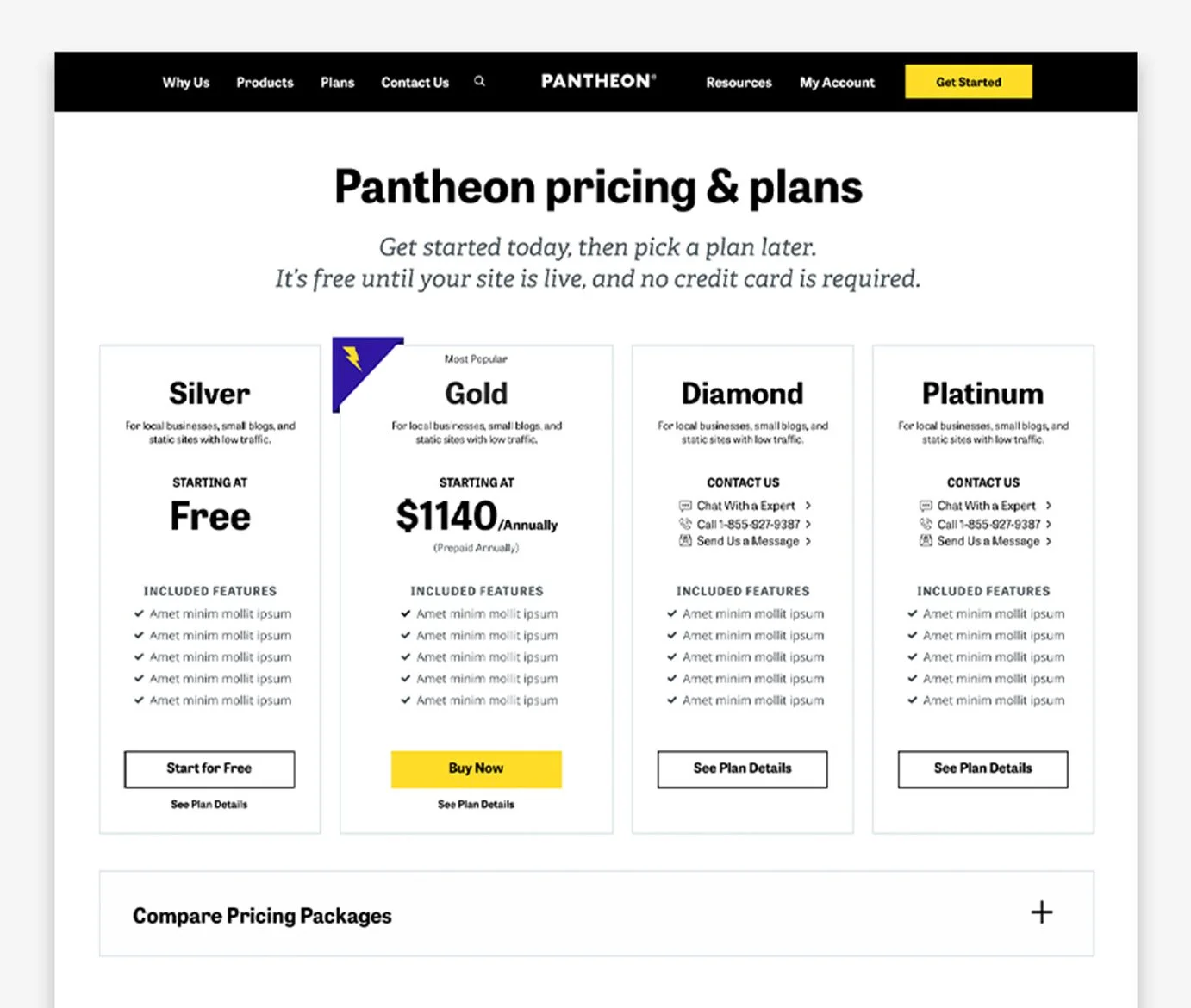
Pantheon Pricing
In 2021, Pantheon pivoted its pricing strategy from Site Hosting to SaaS (Software as a Service). As the pricing page was a key component of the marketing funnel, it needed to reflect this shift and improve customer conversion and profitability. The goal was to redesign the pricing page with a mobile-first approach and A/B test its effectiveness.
Objectives
Clarify SaaS Positioning: Clearly communicate Pantheon’s shift from Site Hosting to SaaS to enhance customer understanding.
Improve User Experience: Design a mobile-first pricing page with an intuitive layout, aligned with Pantheon’s new branding. Establish a clear visual hierarchy for pricing options.
Optimize Conversion Rates: Increase conversion rates by enhancing user engagement through A/B testing.
Enhance User Guidance: Simplify the pricing plan structure and guide users effectively through post-selection steps.
Challenges & Opportunities
Outdated design and inaccessible blue color scheme
Ambiguous visual hierarchy and confusing pricing messaging
Poor user guidance after plan selection
Increase conversions with clear SaaS messaging and modern design
Validate changes with A/B testing for pricing optimization
Original Out-Dated Design
Test Design #1
Test Design #2
Contributions
I led the design of a mobile-first pricing page that aligned with Pantheon’s new SaaS focus. By revamping the layout and visual hierarchy, I ensured that users could easily understand the pricing structure and navigate their options.
Enhanced Visual Design: The new design emphasized Pantheon’s SaaS messaging while creating an intuitive and modern user interface. I addressed the accessibility issues, ensuring a readable and aesthetically pleasing color palette.
A/B Testing: We ran A/B tests to compare the old pricing page with the new design. The updated version significantly increased user engagement and conversion rates.
Interactive Elements: I added hover effects on plan columns and clear calls-to-action (CTAs), such as 'Request a Demo,' making the pricing plans more interactive and user-friendly.
Results:
44% Increase in clicks on the Elite pricing plan (statistically significant at 93%).
238% Increase in "Contact Us" submissions (statistically significant at 95%).
Research & Testing
We conducted usability testing to gather insights on how well the new design communicated Pantheon’s SaaS positioning.
Participants: 10 tech-savvy individuals, sourced via Usertesting.com, none of whom were existing customers.
Goals:
Determine if users perceive Pantheon as a SaaS platform.
Assess if the design layout helps users understand the pricing structure.
Test Findings:
Design Rating: 8/10 users rated the new design positively, appreciating the modern look and feel.
SaaS Messaging:
5/10 saw Pantheon as both a SaaS and Site Hosting platform.
3/10 only saw it as a hosting company.
2/10 perceived it exclusively as a SaaS company.
Test Design #3
User Feedback:
Positive: The design was visually engaging and helped convey Pantheon’s offerings.
Suggestions: Users requested clearer pricing details and more prominent demo options.
Test Design #5
Recommendations for Future Iterations
Pricing Visibility: Display prices directly within account tiers to aid decision-making.
Improved Comparison Table: Make the comparison table sticky, allowing it to stay visible during page scrolls for easier navigation.
Demo CTA: Add a "Request a Demo" button throughout the page to provide a clear next step.
Clarify Silver Plan Messaging: Ensure users understand that payment is only required when the site goes live.
Seamless Contact Form: Place a contact form at the bottom of the page for a smoother user journey.
Usability Test Results:
Design & Layout Rating Feedback: 8 out of 10 participants rated the design and layout favorably, citing modern aesthetics and visual appeal.
Understanding SaaS Messaging:
5/10 perceived Pantheon as both a SaaS and Site Hosting platform.
3/10 viewed it primarily as a hosting company.
2/10 identified it solely as a SaaS company.
Key Insights from User Feedback:
Visual Appeal: Participants praised the modern design, particularly the use of engaging animal graphics.
Pricing Confusion: Users noted the need for clearer and more accessible pricing details.
Feature Clarity: Several participants suggested adding demo options to better understand the product offerings.
Recommendations for Future Iterations
Pricing Visibility: Display prices directly within account tiers to aid decision-making.
Improved Comparison Table: Make the comparison table sticky, allowing it to stay visible during page scrolls for easier navigation.
Demo CTA: Add a "Request a Demo" button throughout the page to provide a clear next step.
Clarify Silver Plan Messaging: Ensure users understand that payment is only required when the site goes live.
Seamless Contact Form: Place a contact form at the bottom of the page for a smoother user journey.
Conclusion
The redesigned pricing page successfully aligned Pantheon’s visual identity with its new SaaS strategy. It improved user engagement, increased conversions, and facilitated a smoother user journey through the marketing funnel. While the results were promising, further improvements—such as increasing SaaS messaging clarity and enhancing the pricing plan display—were identified for future iterations. This redesign ultimately strengthened Pantheon’s market position, driving both leads and profitability


